Problem/Opportunity
Pocket Kado, a virtual pet mobile app using gamification and CBT-I for better sleep, faced a challenge a year after its launch. Despite effective marketing campaigns reaching over 500 users, the Cost Per Install (CPI) was high, and very few users became regulars. A deeper analysis identified the onboarding process as the core issue, being too complex and extensive, leading to a significant drop in user conversion to regular app engagement.
Solution
To address this, a cross-functional team conducted a thorough review and rework of the onboarding process. This involved mapping the onboarding journey, funnel analysis, user feedback collection, and iterative design and hypothesis testing. The team streamlined the onboarding process, focusing on reducing non-essential elements and enhancing user understanding of the app's value.
Impact
80% increase in the conversion rate. The team plans to continue refining the onboarding experience, leveraging the lessons learned to further align user needs with business goals for sustained product growth.
Official Winners of the National Sleep Foundation’s 2023 SleepTech® Award
Pocket Kado, has been honored with this prestigious award that serves as a testament to our commitment to integrating cutting-edge sleep science into user-friendly health products. The NSF celebrates our app as a significant advancement in making sleep insights more accessible to the public, furthering their mission to promote healthy sleep through science and education.
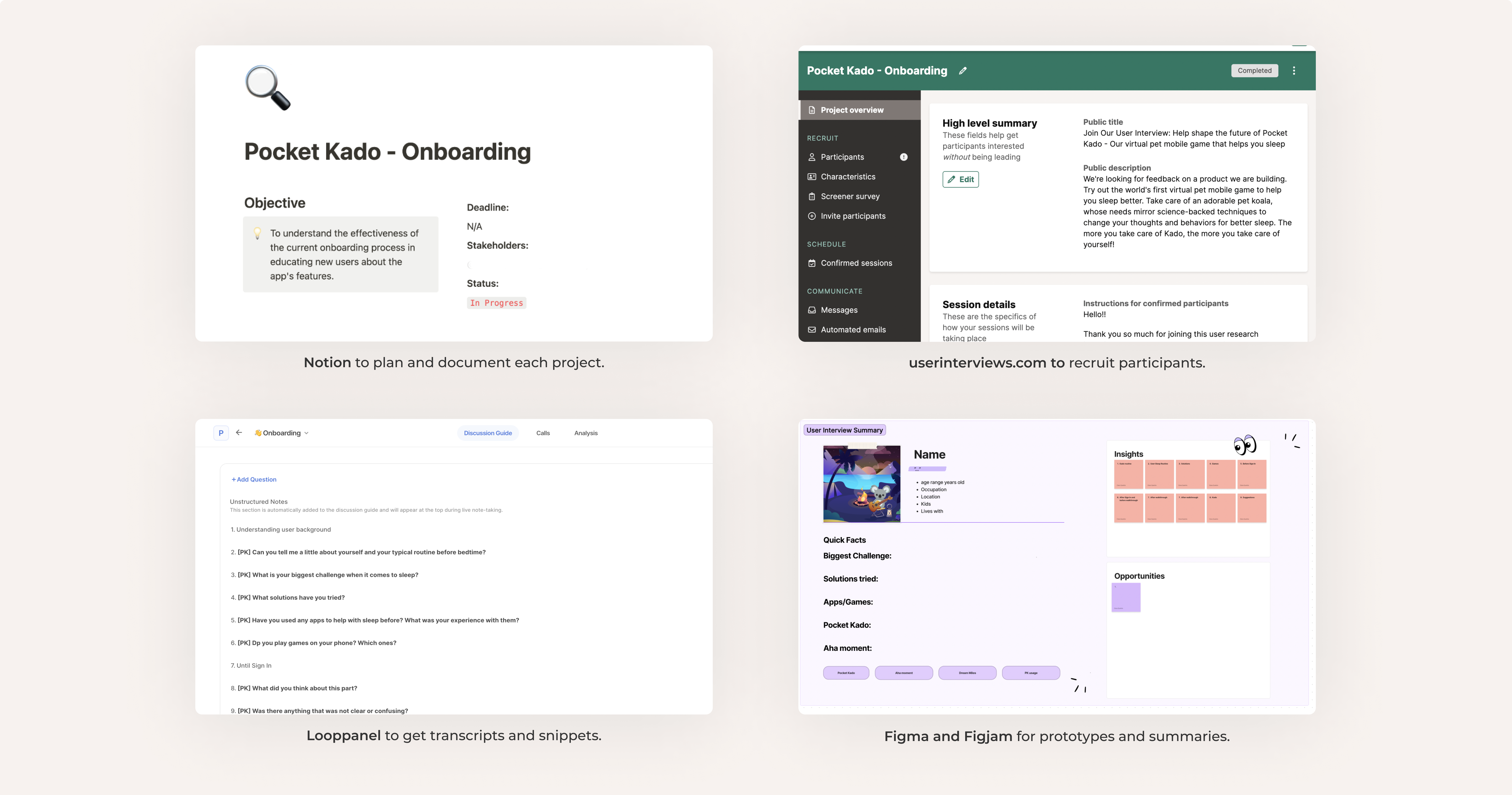
As the founding designer of Pocket Kado, I lead the design initiatives since October 2020, covering user research, UX/UI design, and art direction, while collaborating with an illustrator/animator, a product manager, developers, CTO, CEO, and mentoring a design intern. Despite the challenges of remote work across different time zones, our team's combined efforts led to Pocket Kado's successful global launch. I spearheaded the user interview process, integral for continuous learning and product iteration. My responsibilities encompassed creating interview plans, recruiting participants, and conducting interviews, alongside developing tailored scripts and prototypes. The insights gained from these interviews were crucial in refining the app's design to better meet user needs.
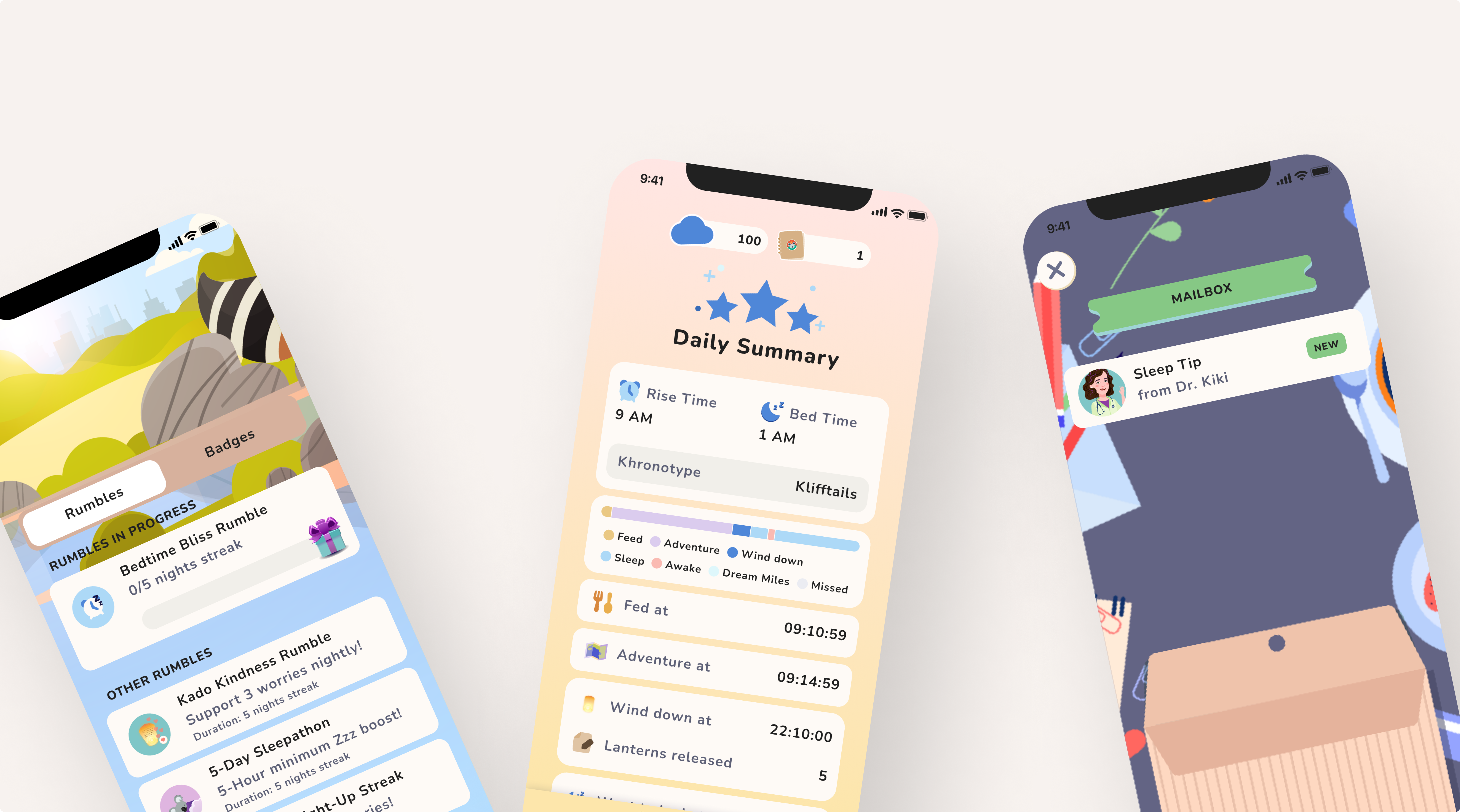
Pocket Kado is a virtual pet mobile app that uses gamification and CBT-I to help people get better sleep in a fun an accessible way. A year after the launch, Pocket Kado encountered a significant challenge: despite extensive marketing efforts, and after a substantial portion of our budget invested in various user acquisition strategies across multiple social platforms, our advertisements were not performing as expected.
Although these campaigns succeeded in reaching over 500 users, the Cost Per Install (CPI) was disappointingly high and only a handful transitioned into regular app users. A deeper analysis revealed that the problem didn't lie within the marketing campaigns themselves. Instead, it was rooted in what happened after the download: a significant drop in user conversion to regular app engagement.
Upon reviewing the app, a prominent issue surfaced: the onboarding process. Its extensive and complex, posing a barrier to user engagement. We were determined to tackle this head-on, with an ambitious goal to dramatically boost our conversion rates.
Collaborative Workshop and Team Structure
We kicked off this project led by our product manager, as we wanted to learn as much as we could.
Our diverse, cross-functional team, consisting of members from product management, design, growth, and engineering, is key to our success. Each member brought their unique skills and perspectives, collaboratively focusing on optimizing the onboarding process
Objective: Minimize Time-to-Value
Our goal was to reduce the time users take to recognize the value of the app. This was achieved through my close collaboration with the product manager. I focused on crafting an intuitive and visually appealing interface, leveraging my design expertise, while the product manager provided essential insights into app functionality and alignment with user needs. This collaborative effort was instrumental in delivering a user experience that efficiently communicated the app's value.
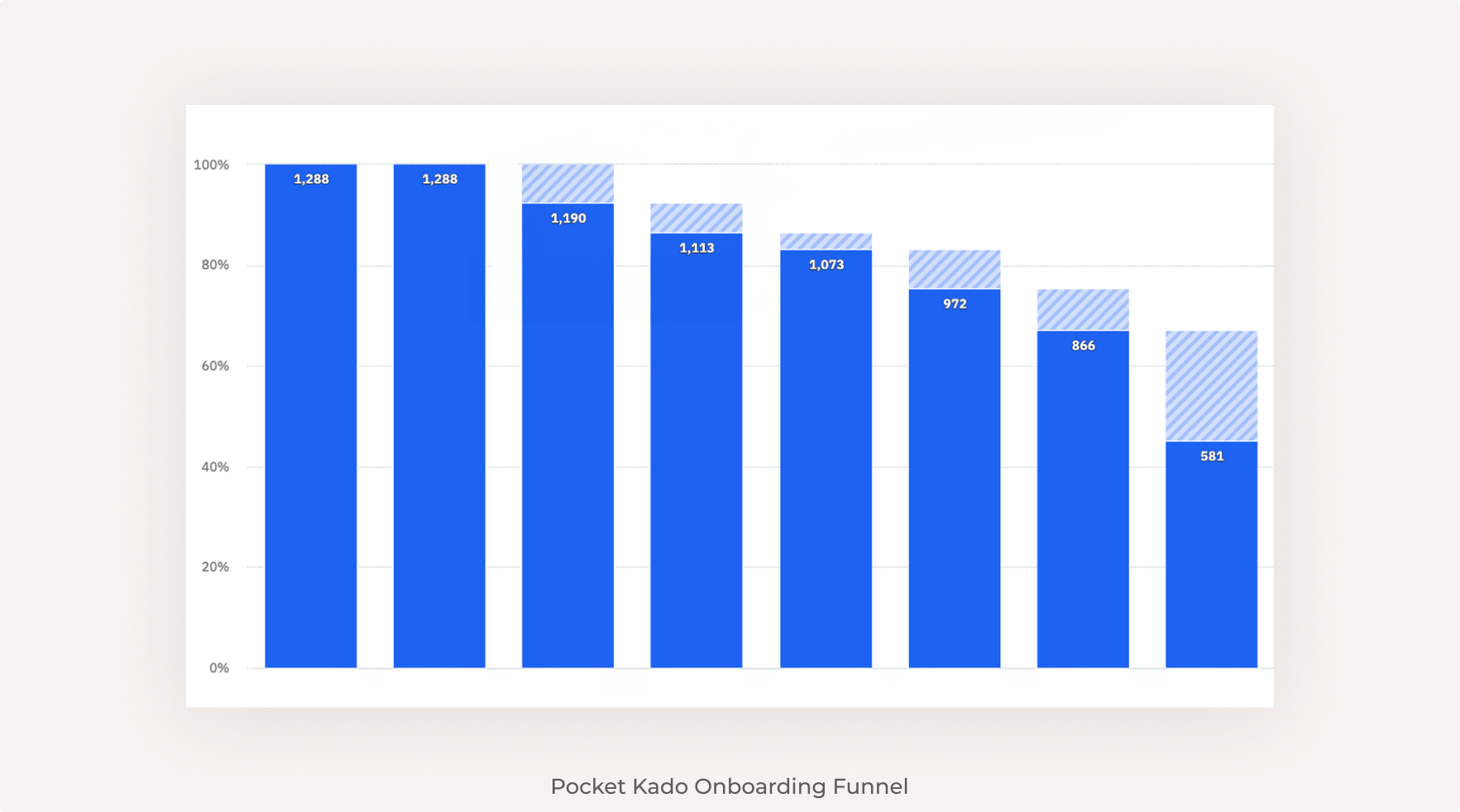
Funnel Analysis and Data-Driven Approach
Comprehensive funnel tracking is essential and necessitates collaboration with your product manager. Such a partnership aligns onboarding with overarching goals, encourages cohesive problem-solving, enhances development efficiency, and guarantees that the onboarding experience fits the user's learning curve.
Our product manager's data-driven strategy played a crucial role in collecting detailed data about user touchpoints, guaranteeing that each event was covered.
Our experience showed that nearly 60% of users were lost during onboarding. Given our investment in user acquisition, this was a stark indicator of the need to rethink and enhance our onboarding approach.
Key findings included:
Major drop-off points such as during the Insomnia Severity Index test, when seeking notification consent, and at the account creation phase.
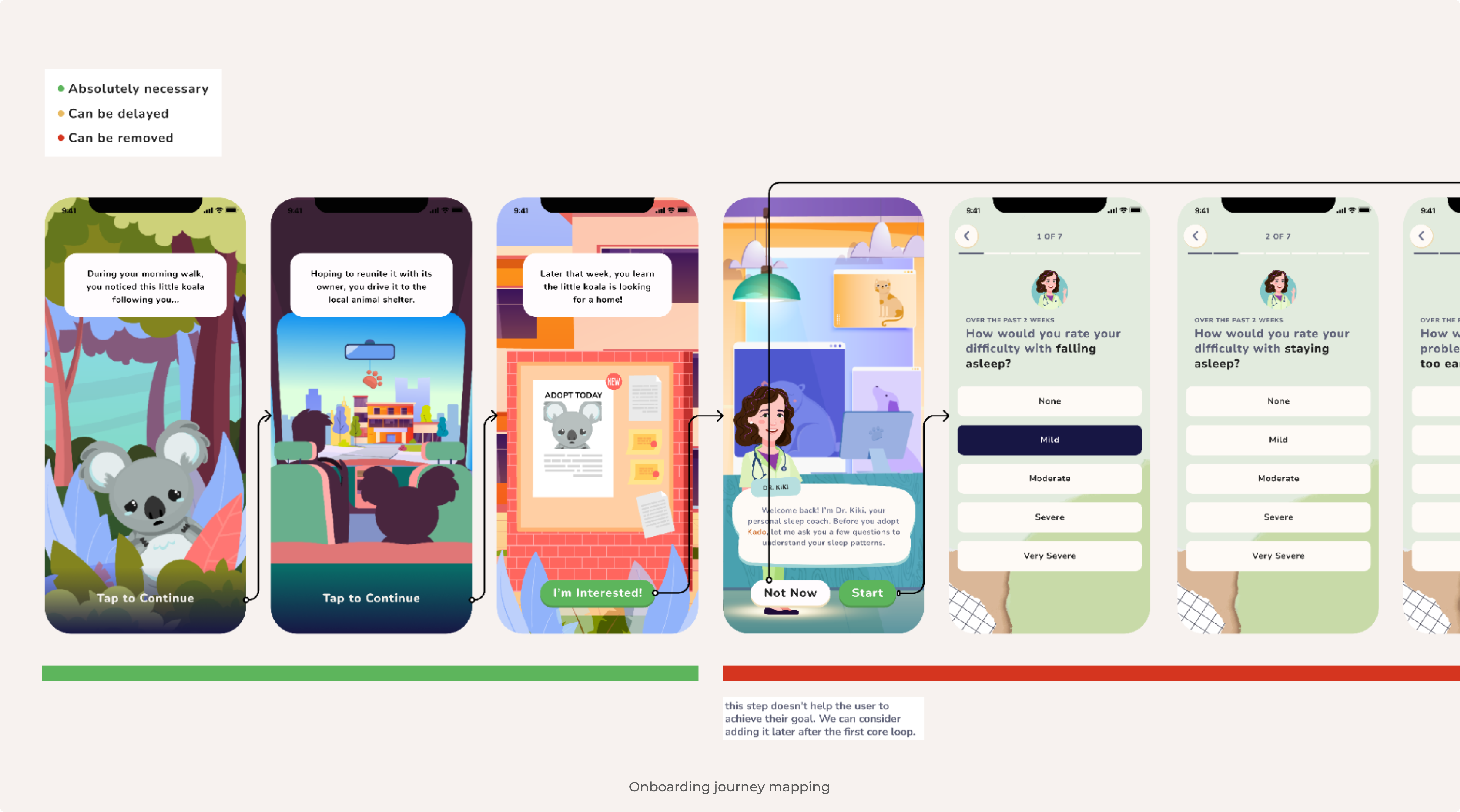
Mapping the Onboarding Journey
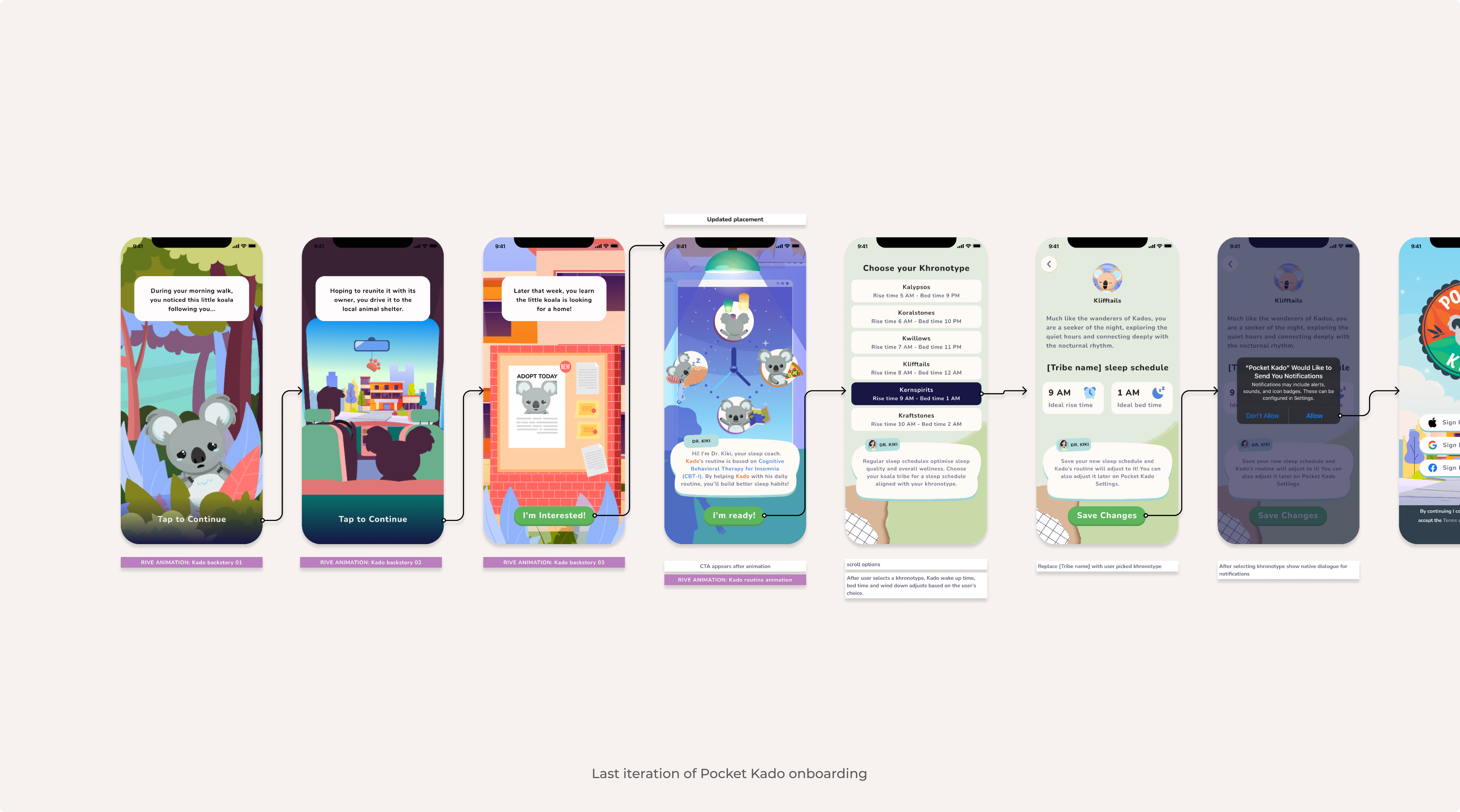
An essential part of our strategy was meticulously mapping the onboarding journey. The onboarding starts the moment the user finds out about your app and it is important to map your onboarding journey step by step, going through each screen, each interaction, as it allows you to see the app from a user's perspective, identifying each touchpoint they encounter. This allowed us to view the app from the user's perspective, identifying potential drop-off points and areas for improvement.
Our initial onboarding process was lengthy, overwhelming users with too much information. We refocused on reducing non-essential elements, aiming to shorten the time-to-value (TTV). We scrutinized each onboarding step, questioning its necessity in relation to our identified 'aha' moment. We employed a color-coding system (green, red, yellow) under each screen to prioritize essential elements and reconsider or remove others.
User feedback
To better understand our 60% loss, it's beneficial to supplement quantitative data with user feedback. We gathered insights from multiple sources including user interviews, Net Promoter Scores (NPS), interactions in Facebook groups, and support tickets. A common theme was skepticism about the app's ability to directly improve sleep.
Curiosity and hesitation before signup: Users showed interest but wanted more information before registering.
Doubts about effectiveness: Users questioned how the app's features could directly enhance sleep.
High appreciation for winding down feature: Winding down and sleep mode were the “aha moment”.
Easy to use and attractive design: Users appreciated the app's usability and aesthetic appeal, but they wanted more immediate information about its features and benefits.
"I feel like there's some good concepts in it. I think for me to want to use it, a. I would need a breakdown of what I'm going to have to do at the beginning."
Catherine
“I understand it's talking about the pet and putting it to sleep, but I would have liked to see a little bit of explanation of what it does for me. Not just the game part of it, but some of the background.”
Ally
“Nothing was confusing. It looked more like a game. Instead of explaining the benefits of why you're doing the certain things and how it's going to help you achieve better sleep.”
Sarah
Iterative Design and Hypothesis Testing
Based on our research, we formulated two hypotheses:
1. Shortening onboarding steps would reduce drop-offs.
2. Focusing on the 'aha' moment and removing extra steps would direct users quickly to the app's value, increasing conversion rates.
User Testing and Feedback Analysis
For a quick iteration on the same day, to test the two hypotheses, I prepared a prototype with a new simplified version of the onboarding. I conducted quick interviews with users to confirm our assumptions about their willingness to complete the entire onboarding process, and whether they understood and were eager to use the app.
"I think it’s a great concept. It's all about self care. I like it’s really simple and not too much, it’s self explanatory you know. It was short and sweet to the point I felt like every word was purposeful. A simple and fun way to track sleep.”
Kate
"I like this back story and that you show how the app will be successful for you, why the use of CBT-I. Before you go into the game you know why you need to do what you need"
Julia
“It’s a really cute idea, the graphics are calming and I love the idea that you need to take care of a pet. It also encourages you to journaling and give tips, this is all in one.”
Hannah
Achieving an 80% Conversion Rate
Enhanced onboarding conversion: We increased the onboarding conversion rate from 45% to 80%.
Deepened user engagement: Users quickly realized the app's value, leading to increased engagement.
Boosting efficiency and sustainability: The redesign attracted more regular users while optimizing costs, extending our runway.
Key Takeaways
Leveraging limitations as opportunities: Viewing constraints from different perspectives helped us come up with fresh ideas. It demonstrated how challenges can be reframed as opportunities for growth and improvement.
Looking ahead: User onboarding is a continuous process, and we need to continue to iterate on the onboarding experience.
Cross-functional collaboration is the key to product growth: Sharing knowledge and working collaboratively made the difference in aligning both user needs and business goals, resulting in a more streamlined and effective user experience.
National Sleep Foundation SleepTech® Award Winner [2023]: Pocket Kado was honored with the prestigious SleepTech® Award from the National Sleep Foundation, recognizing our innovative approach to enhancing sleep quality through technology.