Running payroll is a complex process, and prone to manual errors. Small business owners run payroll manually or depend on third parties to help them in the process.
“I don't have much time for paperwork things, and because we are just two, it's very important for me to do it quickly.”
João António
Beer place owner
“It’s always challenging, errors can happen and sometimes we set up the payroll incorrectly, or we forget and it’s not ideal.”
Cristina
Restaurant owner
“Our accountant is very helpfull but if there is some problem, we need to help solving it. It's time-consuming and expensive.”
Augusto
International transports company
Design a payroll app that allows busy small business owners to run the payroll on the go and be more productive by streamlining their payment process.
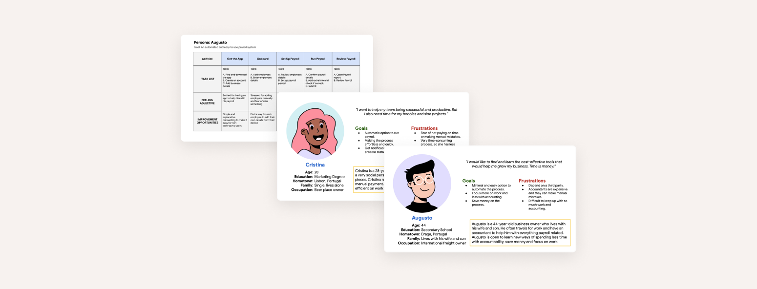
I conducted user interviews with 5 small business owners and created empathy maps to understand the users
I’m
designing for and their needs. A primary user group identified through research was small business owners
who
would like to spend less time with payroll and enjoy their favorite experiences. The second user group
identified was less tech-savvy small business owners that want to depend less on third parties.
Pain Points
● Added responsibilities and a challenging busy day make it difficult for small business owners to run payroll manually.
● Big interest in reducing costs and spend less time with payroll functions.
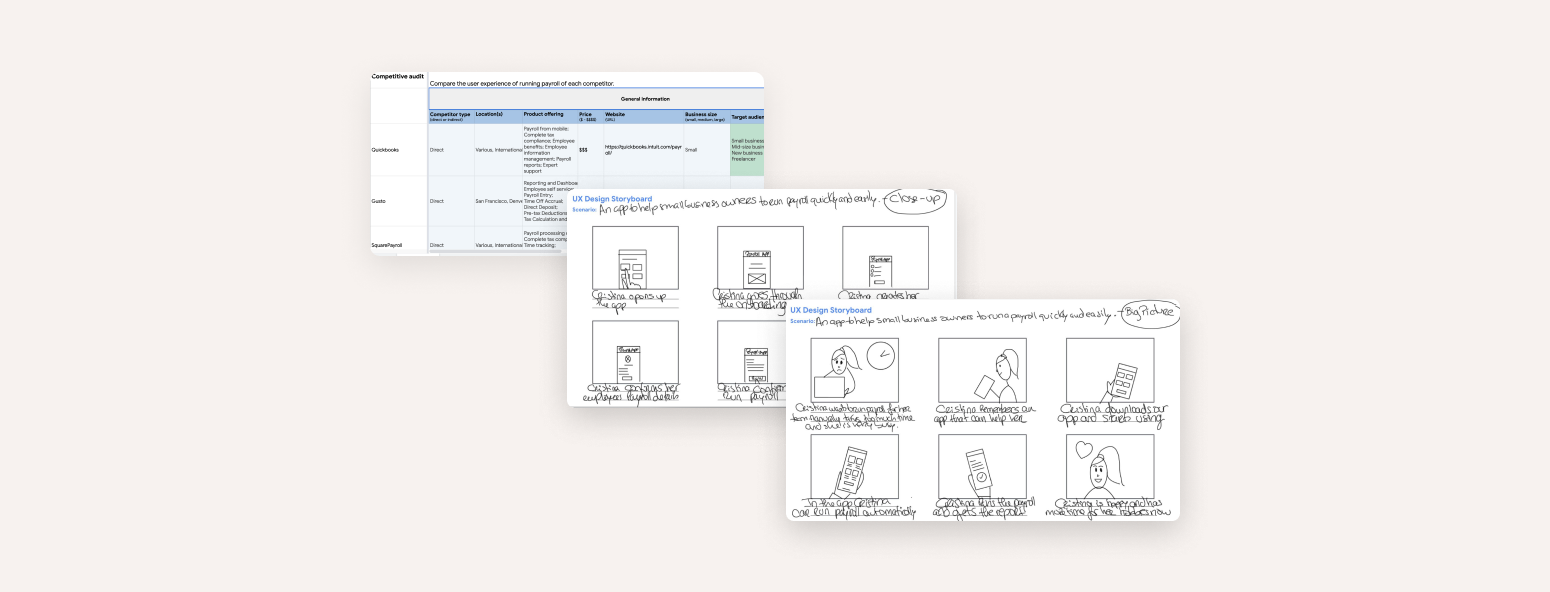
Competitive Audit
To better understand the landscape regarding direct and indirect competitors, I conducted a competitive
audit where I was able to compare strengths, weaknesses, and gaps from their products.
Finding and comprehending where our competitors stand, I could outline a competitive report where
opportunities for improvement for our product to stand out were defined and could later be applied.
Some gaps identified include:
Competitor products don’t offer a specific mobile app to run payroll.
Competitor products are too complex for small businesses.
The onboarding process is too complex in some cases.
Some opportunities identified include:
A simple and straightforward process focused on the main goal.
Integration of voice assistive technology.
Payroll frequency customization option.
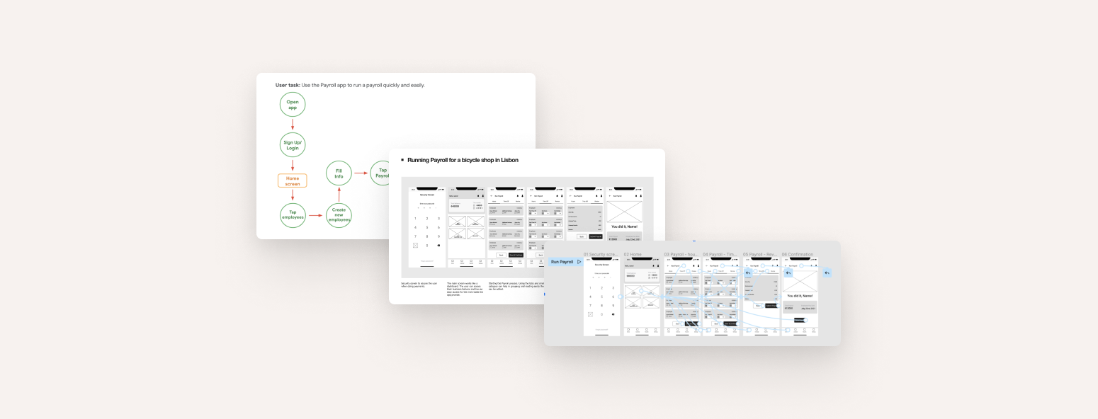
I created wireframe sketches to rough out my design ideas for the main screens.
While working on this initial design phase, I always tried to address the feedback from the user research.
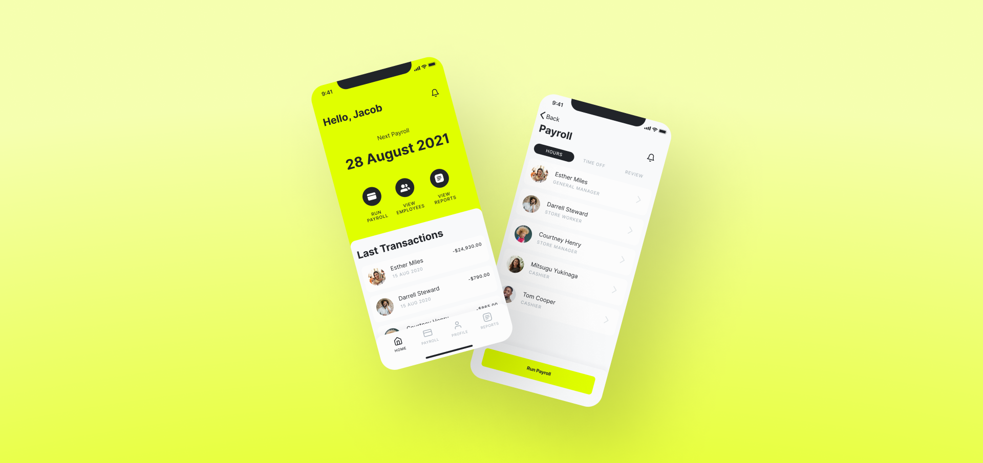
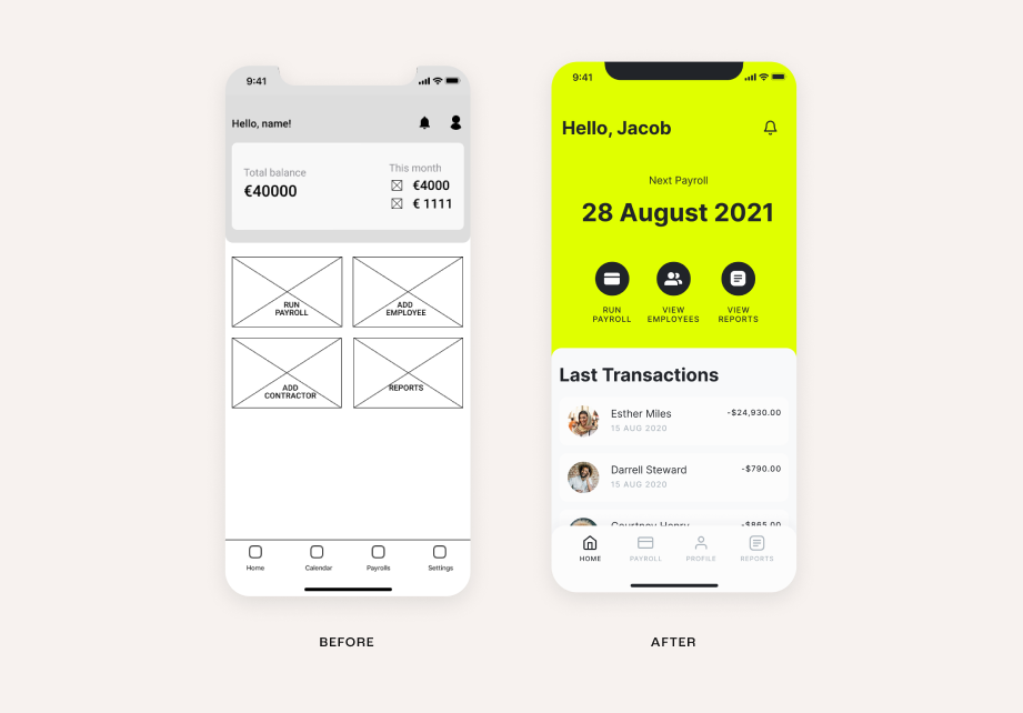
For the home screen, I prioritized a quick and easy payroll process to help users save time.
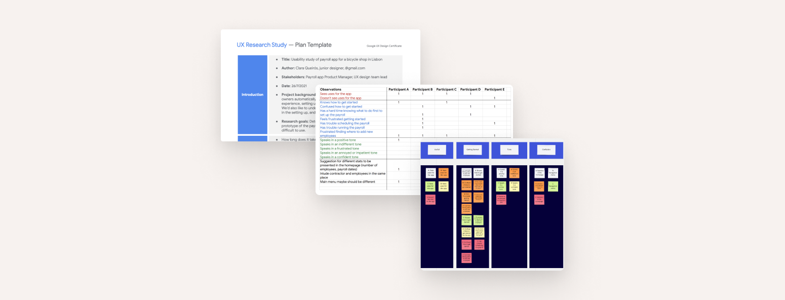
I conducted two rounds of unmoderated usability studies. One study was with the lo-fi prototype and another was later already with a high-fidelity prototype. Findings from the first study helped guide the design from wireframes to mockups. The second study used a high-fidelity prototype and revealed what elements of the mockups needed refining.
Research Goals
If users could easily complete core tasks within the prototype of
the app.
If users could find the employees information they need to setup
their payroll.
Determine the elements of the app that are difficult to use.
Findings & key insights
Users need more intuitive and easier way of the required steps to
start running payroll.
Users want an easier access to employees details.
Easier way of find the CTA “Run Payroll” if there’s a big list of
employees.
Early designs allowed to start the payroll process right away, but the usability studies revealed that it wasn't very clear for some users. After some iterations, I revised the designs to provide a more functional and intuitive homepage and a better experience overall. Each main action in the app has a dedicated icon for easy access.
Usability testing, employee self check-in.
Conduct additional studies to understand if there are pain points that need to be addressed in the process.
More user research can be conducted to determine any new areas of need.
Add option to employee self check-in.
Impact
The app makes users feel like Payroll App thinks about how to meet their needs.
One quote from user feedback:
“What I like about the app is that is focused on running payroll and just that. Getting rid of extras make
it straight to the point. I would use it.”
Add option to employee self check-in.
What I learned
Our designs should always be grounded in rationale to support our decisions. All the beginning steps and
research are setting the foundations for our product. The feedback we get from peers and other stakeholders
is essential to delivering an overall consistent design.
It's also good to keep in mind users come from different backgrounds. Using best practices like simple
universal patterns can help somewhat.